Inspiring Everyday Graphic Design Articles


The most inspirational things are often right in front of us. It might be the typography on a book cover, the colors of your favorite music album, the opening titles in that movie you saw yesterday. To celebrate all those little moments of inspiration, we have compiled some resources for you which honor the beauty of everyday graphic design and the ideas behind it. Perfect to squeeze into a short coffee break. Enjoy!
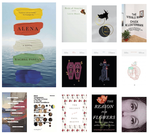
Artworks On Your Bookshelf
We learned not to judge a book by its cover, but, honestly, there is nothing quite like browsing through a bookstore, soaking up covers, their colors, their typefaces, their layouts, every little detail. The variety is endless, and sometimes you’re lucky and find a little piece of art shining through the sheer mass.
To show their appreciation for excellent book cover design, Ben Pierrat and Eric Jacobsen brought the Book Cover Archive to life, a showcase for unique cover designs. It’s inspiring to see how designers boil the idea behind a book down to the limited canvas space of one rectangle. What will it inspire you to? Perhaps something extraordinary, like your own series of book covers made with HTML and CSS?
The Magic Of Film Titles

Until 1955, cinema audiences didn’t get to see the title sequence of movies. Then a note on the film reels for Otto Perminger’s The Man With The Golden Arm changed everything: “Projectionists — pull curtains before titles.” The opening titles which Saul Bass created for the movie wrote history and marked the birth of an entirely new design field. Fortunately, because without this change of thinking, a lot of treasures wouldn’t exist today.
If you want to dive deeper into current and past film titles, into the stories and the creation process behind them, make sure to check out Art of the Title. The site was founded in 2007 to honor film title makers and is run by an enthusiastic team of three. A fascinating place that preserves and celebrates the history of this craft.
The Forgotten Art Of Album Covers
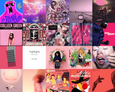
The album cover was once an important part of music culture, with artists specializing in them and gaining fame with their work. Today, in times of digital downloads and streaming, the covers have lost their original purpose and live rather unnoticed in the corners of our smartphone screens. Unfortunately, because there are still some real gems out there.
The project Album Colors Of The Year by Marcos Rodriguez and Zé Felipe draws attention to this design genre by showcasing the best covers of 2015. But the site is much more than only a showcase: the covers are arranged by color and hovering over one of them reveals the hex color value of its dominant color. A treasure chest for any designer. Could there be a better source for some fresh color inspiration?
Graphic Design On A Square Inch

Stamps are boring? Not at all. They are the perfect example that great design doesn’t need a lot of space to fully unfold. For a fresh view on stamps, one that breaks with the widespread idea of a stamp collecting nerd, the Punk Philatelist is your place to go. The blog celebrates the passion with which artists create those tiny works of art and looks at the stamp collectors community with a wink. And if that’s not enough inspiration yet, the Postage Stamps collection on Flickr will keep you busy for quite a while, too. Eye candy par excellence.
Paying With A Piece Of Design History

We use them daily without paying a lot of attention to them, yet they are one of the most challenging things to design: banknotes. If you take a look around the world, they couldn’t be more diverse. But, let’s be honest, did you ever get the chance to hold a banknote from the Maledives in your hands? (Probably not, which is a pity, because they are actually very beautiful.) While world travelers are lucky enough to catch a glimpse of all those unique, sometimes exotic, designs, the rest of us can find their dose of inspiration in online banknote showcases which turn out to be a rich source of color, typography, and pattern inspiration.
Another source for brilliant banknote design is the recent redesign of the Norwegian Krone bills. The Norwegian Bank called out competition to find the design for the country’s next banknote series and released a catalog (PDF, 3.1MB) showcasing all entries for us to indulge in. The PDF is in Norwegian, but the designs are worth taking a look as they tackle the given maritime theme in so many different ways, ranging from black-and-white photography to collages and children’s drawings. A very unconventional approach to banknote design. The winning design, by the way, merges Norway’s past und present with a rather traditionally designed front and a pixelated back.
What’s more left to say as: Keep your eyes open! The best kind of inspiration might indeed lie where you least expect it.